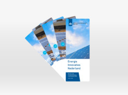
In an assignment for the Netherlands Enterprise Agency, I was challenged to present reports of sustainable projects in an innovative way. After research, the report turned out to be the best in a digital environment. The report had many pages, making it an intensive task to read through. By using interactive buttons to divide the content into smaller pieces, it is more pleasant for the target group to read. Visual icons provide the user with easy directions for navigation. In addition to the website, I have created a project fan that can be distributed to interested parties. In this way, the projects become tangible and are easy to scroll through. The prototype was an experiment for the government to present information in innovative ways.
Share
